
We don’t think that there are many websites out there that don’t have any menus at all. Maybe those small, business-card-like one-pagers, but that’s really not the effect we’re going for in this guide.
You need the menus!
Here’s how to work with menus in WordPress:
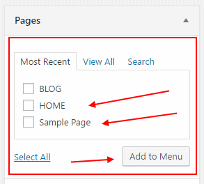
Go to your wp-admin / Menus. This is where everything takes place. Begin by checking the individual pages that you want to have on the menu, and then click “Add to Menu”:
At this point, you will see your new pages on the right-hand side. The cool thing is that if you want to rearrange the pages, everything works with drag-and-drop. But the main thing to do here is to assign the menu to one of the available locations and save it.
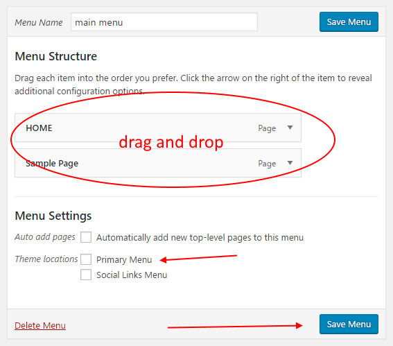
Now you have your new menu created and assigned to the main menu area.
For more variety, you can also create separate menus for your social media profiles, or anything else that makes sense. WordPress doesn’t limit you in any way.
But where to display all those additional menus? This is where widgets come into play.
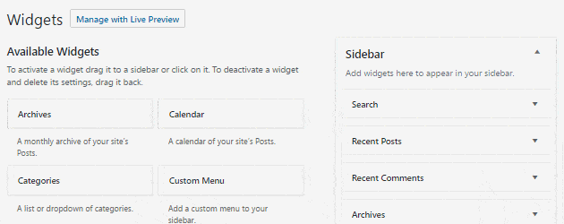
All WordPress themes come with at least one widget area, usually more. Widget areas define the specific spaces within your theme design where you are allowed to display custom blocks of content.
You can see this by going to wp-admin / Appearance / Widgets. There are available widgets on the left, and widget areas on the right. What you do is quite simple – just grab a block from the left and drag and drop it somewhere on the right.
4. Confirm that Your Website is “Mobile-Friendly”
Making sure that your website is optimized for mobile viewers is more important than making sure that it’s optimized for desktop.
It’s not that we wholeheartedly believe in the principle itself, but we do believe in the raw data. It just so happens that mobile traffic is now bigger than desktop traffic (data is confirmed). This means that by not having a mobile-optimized site, you’re potentially losing website traffic.
How to achieve mobile optimization?
First, you need to check if your current design is mobile-friendly. There are a couple of ways to do that:
1. Go to automated tests.
Two popular solutions include:
- Mobile-Friendly Test by Google
- Mobile Friendliness Test Tool by Bing
There’s no inferior tool among these two. It’s a good idea to use both, and see what they have to say about your site.
Simply go to either of the above, enter your website URL, and wait for the results. Takes only a minute.
If you’re lucky, both Google and Bing will say that your site is optimized. That’s good. You can stop reading this section of the guide.
If not, you will be given some suggestions and tips on what you can do to improve the situation. We’re not going to go through that here, since every website scenario is different, and anything I’d share here wouldn’t be applicable in most cases. In short, just follow the tips given by Google and Bing.
Note that it’s worth to check not only the main URL of your website – the homepage – but also a small set of subpages, particularly:
- your blog listing,
- example single blog post,
- example single page,
- any custom landing page you have.
2. Do manual tests.
You can carry out the manual tests yourself. They are more about your own subjective impression of the site’s mobile-friendliness, rather than data-based calculations.
To begin, go to the WordPress Customizer. Take a look at the bottom left corner:

Those buttons allow you to switch between common device sizes, so you can see how the site behaves. It’s a very handy tool, and it lets you see if everything is in order. Make sure that:
- all texts are readable,
- images aren’t too big or too small,
- ideally, there should be no horizontal scrollbars,
- the balance between image size and text size is correct (so one is not overpowered by the other),
- the menus work properly (sometimes it’s an issue with the design on the mobile).
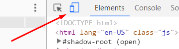
Apart from WordPress’ own tool, you can also use the options available in the Chrome browser. Go to the main menu and access the “Developer tools”, or just press Ctrl+Shift+i on your keyboard (Win).
Then you can click the “Toggle device toolbar” button:
You will be able to alternate the viewing mode between specific popular devices. For instance, you can view your site like it appears on the iPhone 6 Plus, iPhone 5, Nexus 5X, and more.
I encourage you to use both Chrome and WordPress’ tools to really examine how your site behaves, and check if everything is in order.
3. Fix things
If your current theme doesn’t pass the mobile-friendliness test, unfortunately, there’s not much you can do without getting your hands dirty and going through a lot of source code.
In an extreme scenario, you might have to pick another WordPress theme. After all, if a theme is not mobile-friendly approaching 2017, it doesn’t look good for its reputation.
Don’t panic! You can still experiment with the following. There are two alternative paths you can take if you don’t want to change your theme:
(a) Experiment with “tune-up” plugins:
- Easy Google Fonts – You can use it to change your typography settings in order to make texts more readable on mobile.
- Responsive Menu – Helps you fix your menus and make them mobile-friendly.
- Adaptive Images for WordPress – Helps you load your images more effectively on mobile.
(b) Get a mobile plugin:
There’s a plugin called WPtouch. Once enabled, it checks every visitor coming to your site, and if they’re on mobile, it displays them a separate, alternative version of your site design.
Be aware that it takes over the appearance of your site on mobile completely, so your visitor no longer sees your current WordPress theme.
If you don’t want to change your main theme, and your site is still not mobile friendly, then the WPtouch plugin is probably the best solution.